Workshops and Teaching
Stanford Continuing Studies - Winter 2024 - Online Zoom
REGISTRATION - CLASS is FILLED
Art 50 - Calligraphy & Letterform: History, Methods, Practice
February 7 - March 13, 2024
Six Wednesdays — 7:00 - 8:50pm Pacific Time
____________________________________________________________________

Targeted exercises
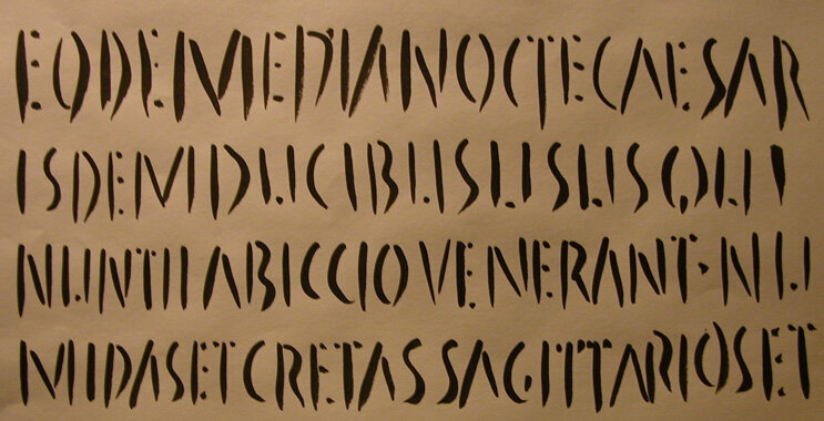
The course covers letter structure, freehand writing, and a close look at Uncial, Humanist Minuscule, Blackletter and Italic hands. Each of the many exercises promotes understanding of design principles and spatial awareness while gaining mastery over a wide range of tools.
LEARN THE BASICS OF HANDLETTERING!
Letterform is a blend of structure and movement and its background is immense. This class introduces the practice of calligraphy, providing historical reference and guiding the student in writing formal scripts with confidence. We begin by learning the structure of the Roman alphabet, formal and expressive stroke techniques using pen and ink, and a time-honored grid system for page layout. An expressive, contemporary approach to freehand writing is covered extensively using pencil, brush, and marker, and focusing on rhythm and proper spacing.
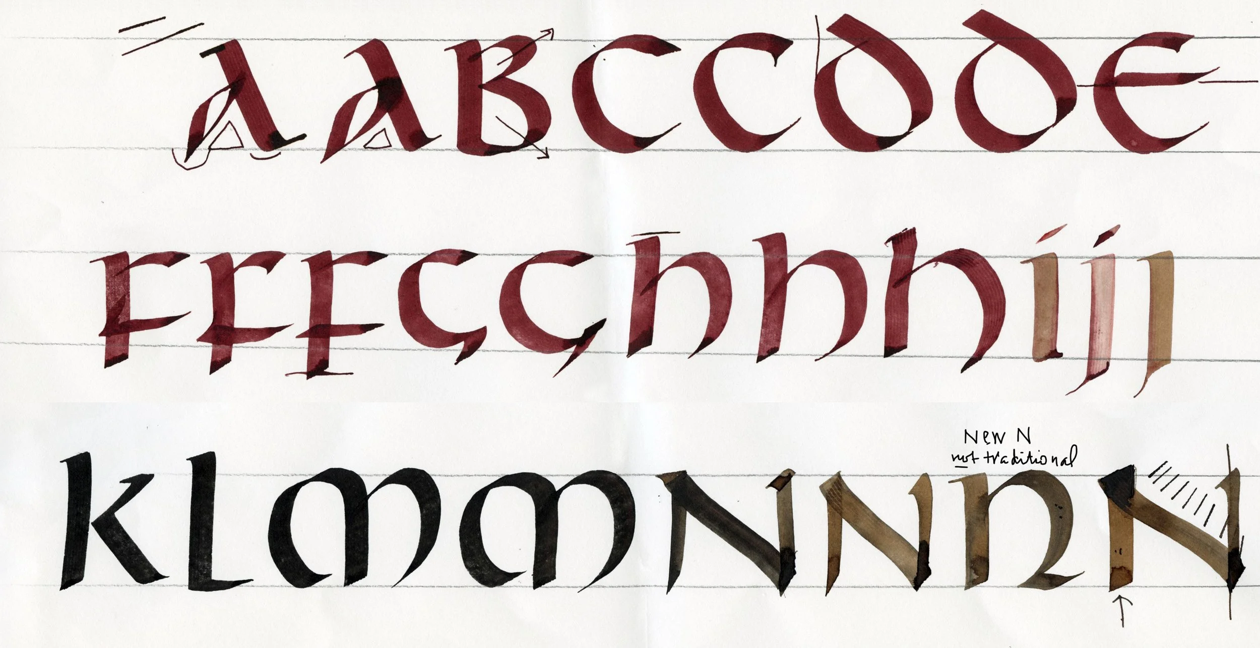
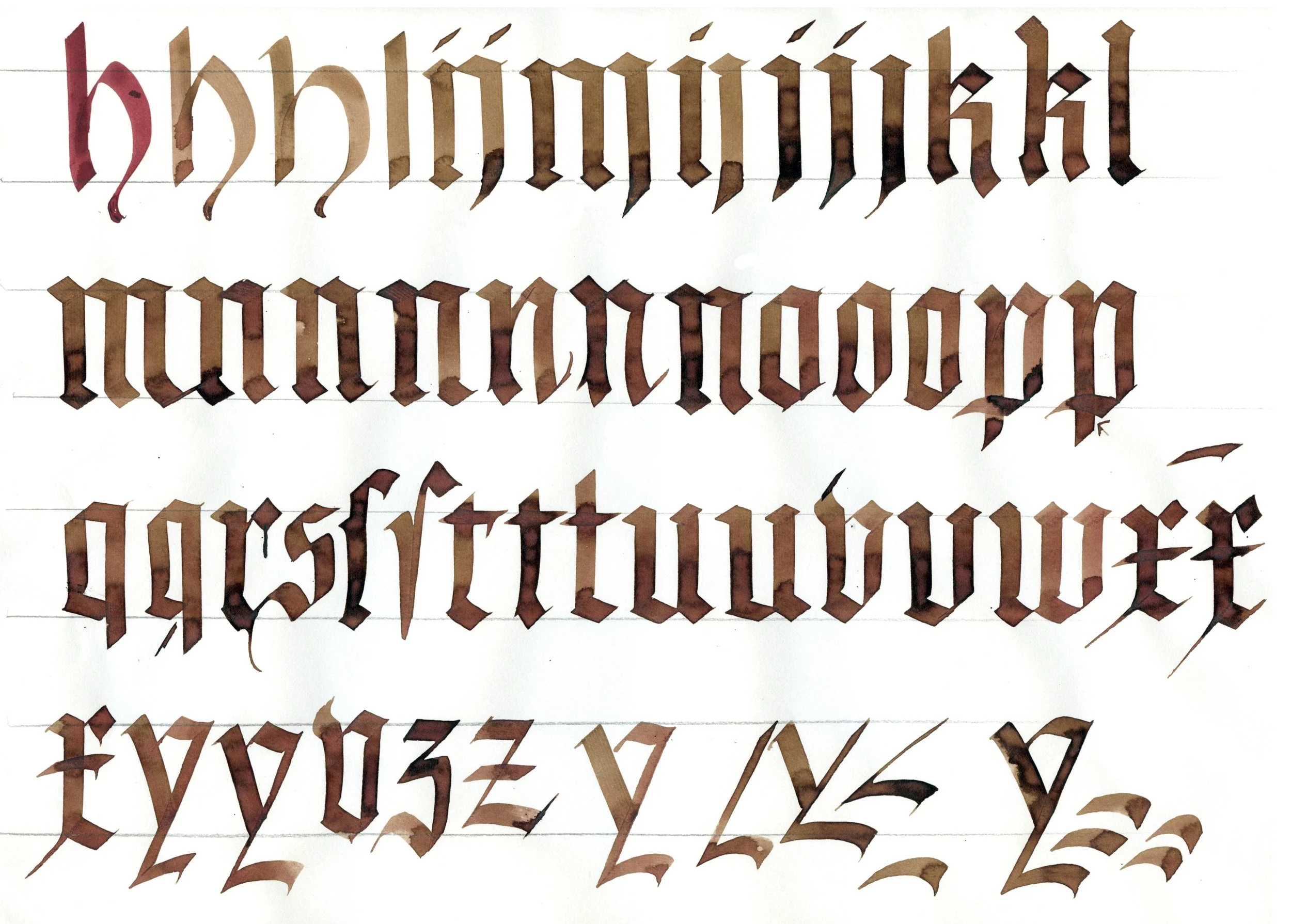
We study four formal scripts in depth: 1) Irish Uncial; 2) Classic upright 15th century Humanist Minuscule, the basis of our print script; 3) Gothic Blackletter Script, noted for its structural system and graphic impact; and 4) Italic, our foundation for fluid cursive writing. Each script learned offers a fresh insight into form and design. Additional scripts and variations are introduced and discussed.
Weekly assignments include alphabet practice, small fun projects, and several more complex design projects. Live demos support the development of technique, design skills, and self-critique. Each session includes time for feedback and discussion. Exercises cover positive/negative relationships of letterforms, visual rhythms, textures and forces, and other aspects of text art and design. By focusing on individual components, we absorb a complex subject without being overwhelmed. Students will have access to examples from my large personal reference library and will be well prepared for further individual studies and workshops. I am present online daily to respond in detail to your posts.
Calligraphy is visual music, meditative and seismic, conveying personal meaning. It’s your permanent voice.
This Zoom course is open to students of all skill levels. Students must purchase their own art supplies and can expect to spend an additional $85–$120 on these materials.
Register for Art 50 online beginning December 4, 2023: https://stanford.io/46gkeur
Courses have a class limit of 30 students and cost is $385.

Live demo with discussion
All alphabets are studied one letter at a time with variations, historical background, and practical tips. This demo uses a double pencil tool for analysis of proportions and pen angle of Italic script or chancery cursive, from Week 5.
The following images are from my online demos. The first two sessions deal with learning the basics of letterform history, freehand writing, rhythm and flow, monoline writing and spacing, grid concepts and composition.

Week 2 discusses brush stroke, direction, and pressure and release variations.
Week 3 introduction of broad edge work: Uncial forms as well as Humanist Minuscule
Lively interactive discussion in Week 4 stimulates variations and while I illustrate the pros and cons of each letterform as it is made. Filigree is also addressed.
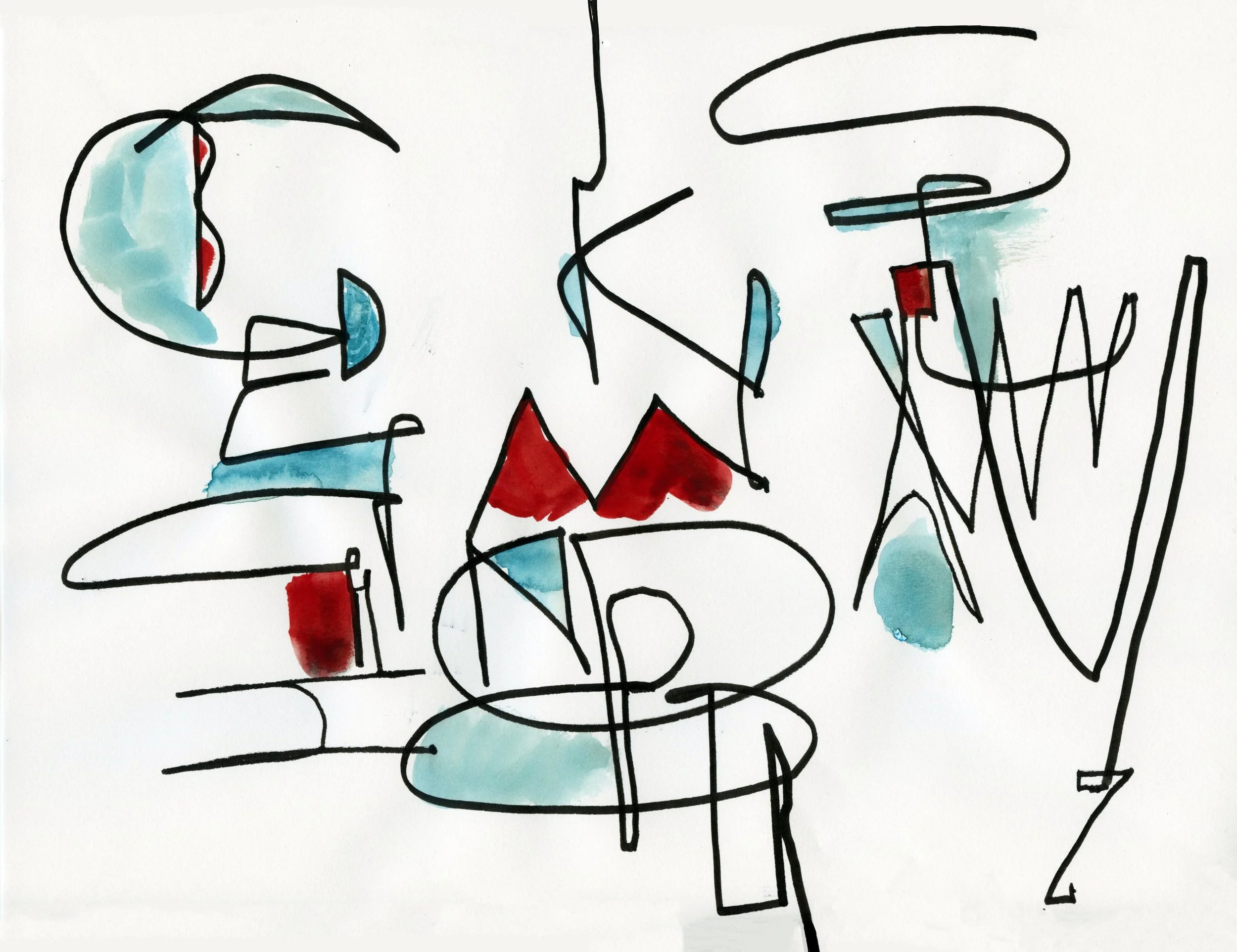
In Week 6 we play with arrangement and color, balance, and design flexibility while carrying out a consistent theme all the way to the end. In this case it was writing the alphabet using alternating wide and narrow letters that attached to the edge while creating memorable intershapes. Imperfection can be strong. Adding color is a further exercise in balancing the forces of the page.
A Grid Exercise
We simplify the letterforms, boiling down to essentials. In this case, using Roman capitals, students used simple brush strokes for verticals and diagonals and substituted dots for all horizontals. A loosening-up exercise that promotes rhythm, analysis of balance, and equal spacing of elements.
FALL 2023 ZOOM ONLINE
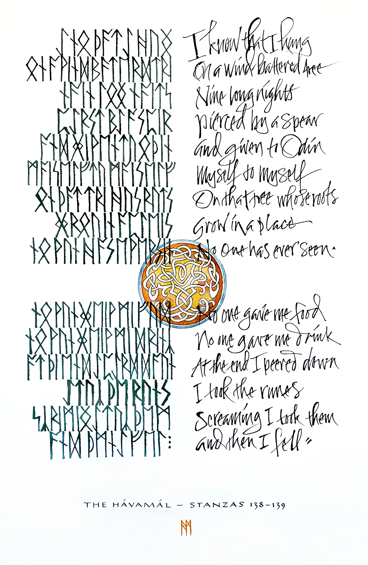
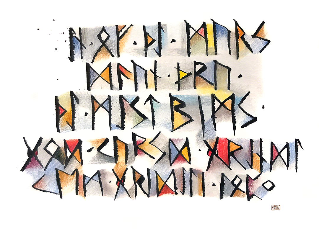
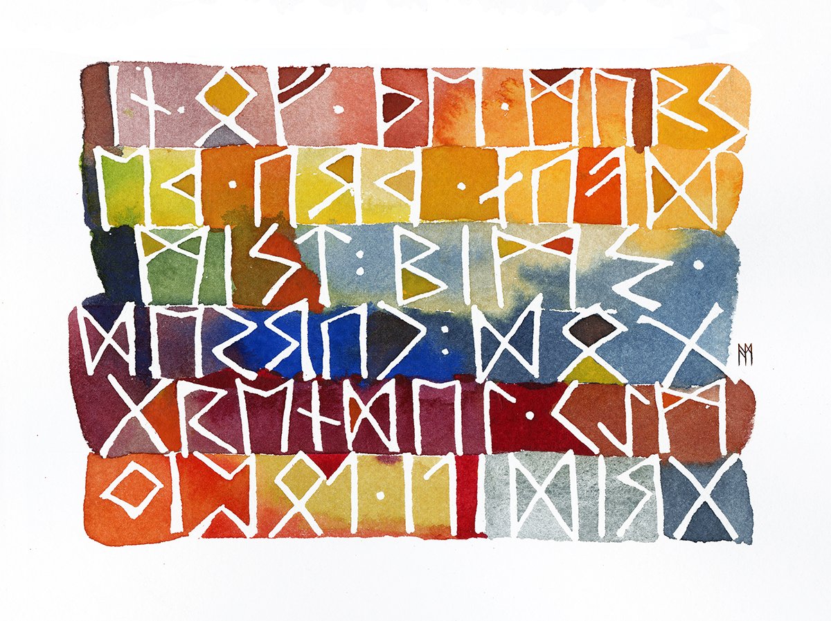
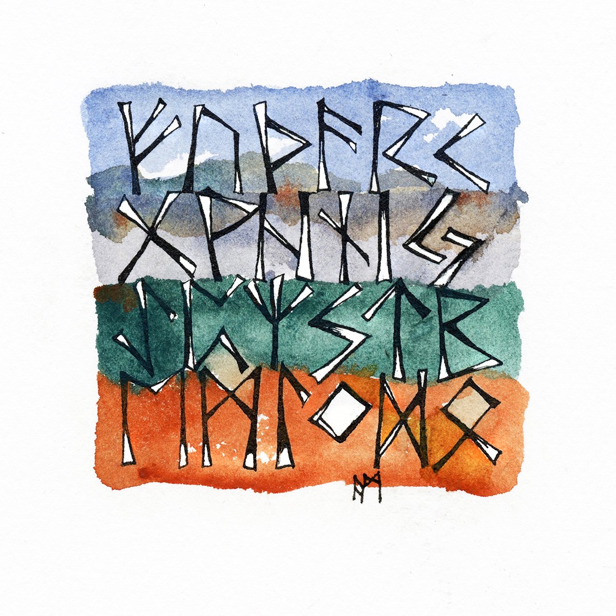
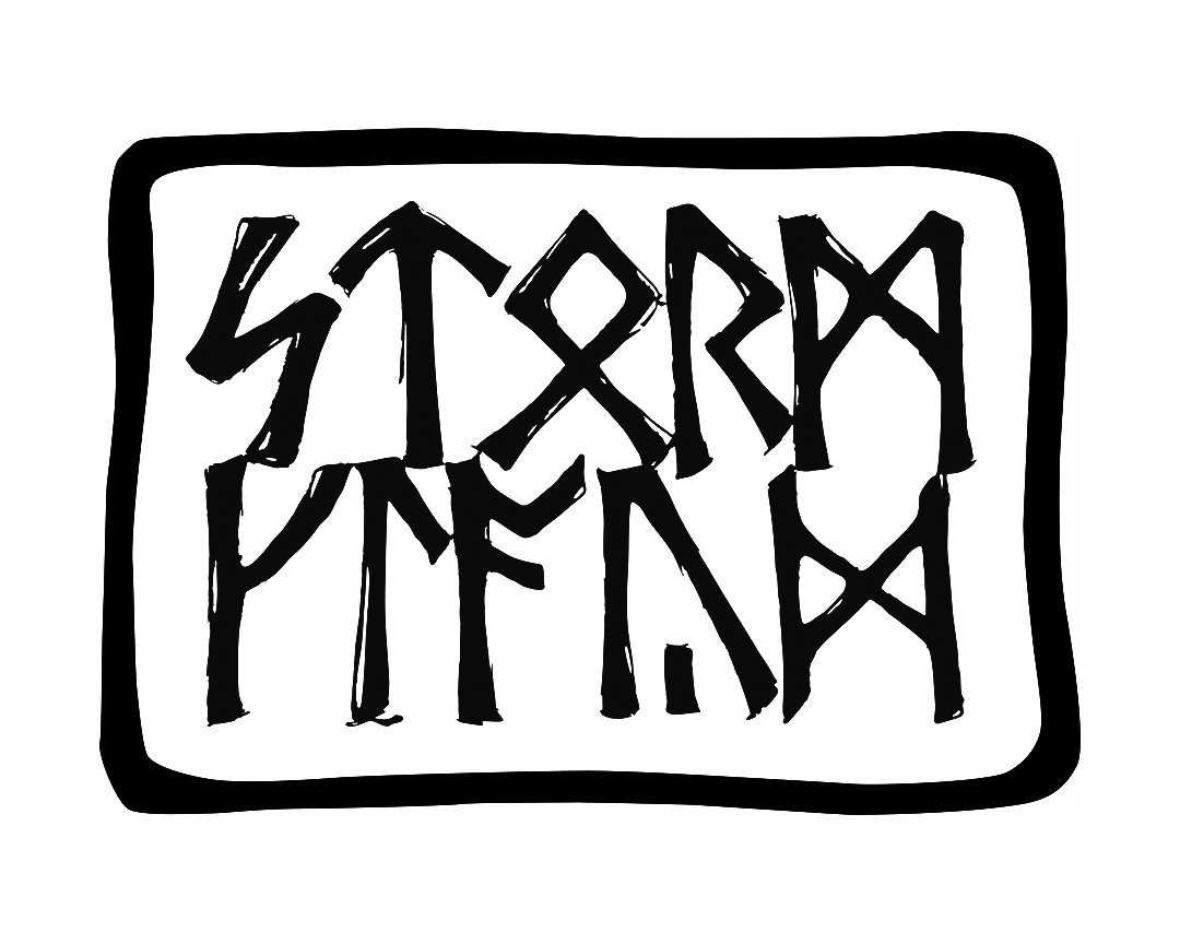
ART 53 – Calligraphy Design and Norse Runes
September 27 - November 15, 2023 - Eight Wednesdays from 7:00 - 8:50pm Pacific Time
USING RUNES IN TEXT ART AND DESIGN
The purpose of this eight-week course is to study runic symbols and use them effectively in your work. Knowing more of these early root signs and symbols provides deep grounding to your sense of letterform.
This is a highly interactive class. Students learn the names of the runes, their meanings and phonetic equivalents, and organize artwork using a classic grid method as well as asymmetrical freeform design. We study Elder and Younger Futhark, Anglo-Saxon runes, and the Ogham alphabet, and explore their potential in text art.
This class will appeal to designers with an interest in Nordic history and language, to artists who want to explore the deep roots of mark making, and to all who want to explore a new conceptual or visual field. Graphic designers, painters, book artists, and others interested in letterform will find a new world of stimulation and reference for creative work.
Elder Futhark engages the visual artist and scribe with its angular construction and straight design. This is a unique opportunity to learn more deeply about runes and how to use them, following a classic method for letter and font design to shape your artistic footprint in a fun and inspiring way.
Course activities:
Construct the 24 symbols of Elder Futhark
Write runes as word, monogram, and pattern
Projects for everyday use, such as drawing your own runestone
Complex, layered full-page text art designs
Work with ink, resist, and watercolor techniques, a wide variety of pens and brushes, to build gradually evolving text art pages
No prerequisite. Projects are straightforward. Left-handed scribes welcome!
Hopefully this course will be offered again in Summer 2024. Stay tuned!

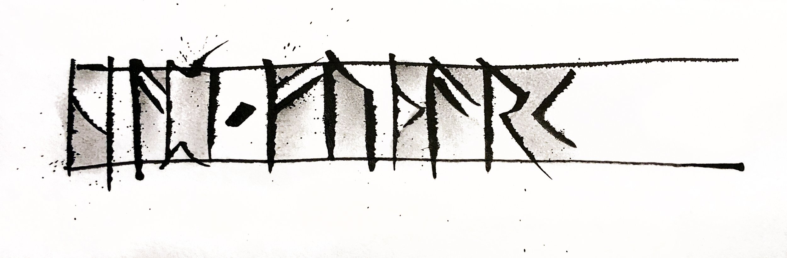
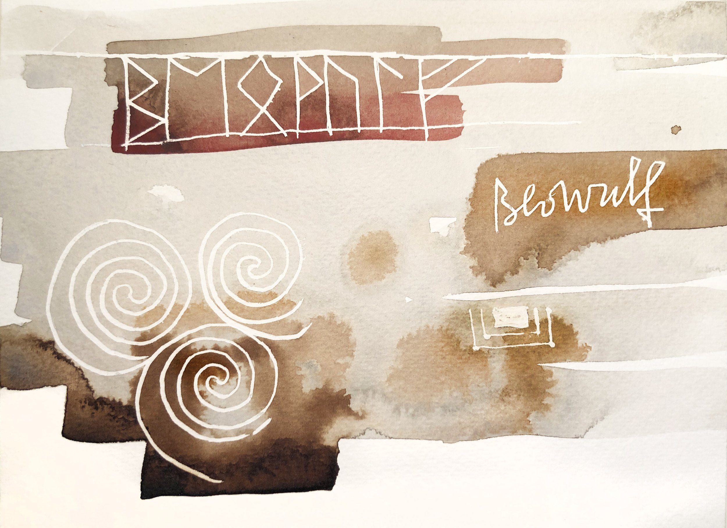
Quote from Beowulf
Written in sumi with ruling pen and worked with gouache and watercolor.

____________________________________________________________________
Stanford Continuing Education - Winter 2023 - Online Zoom
February 1 - March 8, 2023 - Six Weeks - Wednesdays from 7:00 - 8:50pm Pacific Time
ART 53 – Calligraphy Design and Norse Runes
USING RUNES IN YOUR TEXT ART DESIGN!
The purpose of this six-week course is to introduce runic symbols into your artmaking, to use Elder Futhark in personal ways while absorbing some of the history and charm that surrounds these ancient symbols. Early examples of Norse Runes are at least 2,000 years old, though their origins must be much more distant in time. Knowing more of these early root signs and symbols provides a certain stabilizing force in our present-day digital world.
This is a highly interactive class, with exercises throughout. Students learn the names of the runes, their meanings and phonetic equivalents, and organize artwork using a classic grid method and asymmetrical freeform design.
This class will appeal to those with an interest in British, Northern European, and Scandinavian history and language or those who simply enjoy exploring a new field. Graphic designers, painters, book arts professionals, and other fine artists interested in mark-making will find a new world of stimulation and reference for visual creative work.
Elder Futhark, our oldest runic writing system, engages the visual artist and scribe with its angular construction and straight design. Students learn to draw runes using a variety of tools and media and to use diverse methods and approaches. No background or prerequisite is needed as projects are simple and straightforward, evolving one step at a time. Even left-handed scribes can enjoy producing these user-friendly monoline forms!
Course activities include constructing the 24 symbols of Elder Futhark; designing runes as word, monogram, and pattern; and creating simple projects for everyday use to complex, layered full-page text art designs. Individual projects using ink, resist, and watercolor techniques, as well as a variety of pens and brushes, build gradually toward creating original and surprising text art pages.
This course is a unique opportunity to learn more deeply about runes and how to use them, following a classic method for letter and font design to shape your artistic footprint in a fun and inspiring way.
NEW LETTERING CLASSES - 2021
San Francisco Center for the Book
Saturday, August 21 - onsite all day from 9:30a - 5:30p
Calligraphy Essentials :: Texture & Grid, Point & Edge
This workshop will help you design your text art with confidence. We work with tools, materials, and concepts, developing compositional rhythms in writing design. The simplest of letterforms, capitals and minuscules that we use every day will be all you need to begin.
We will use the Point Grid to create text art with varying rhythms and an eye for balance and visual impact. We will also explore a brief history of punctuation and bring some of that influence into the day's artwork. In the morning we will look at grid/spacing, experimenting with tools and abstract concepts, and working without ruling guidelines; then in the afternoon we’ll work with full pages of freehand writing and guided multilayered work. 8 hours! Click to read the overview and sign up for this active day! Be sure to reply or message me if you have questions, or contact SFCB. https://sfcb.org/civicrm/event/info?reset=1&id=4089
____________________________________________________________________________________________________
Stanford Continuing Education - Fall 2021 - Online
October 13 - November 17, 2021 - Six Weeks - Wednesdays from 7:00 - 8:50pm
Introduction to Calligraphy and Letterform: Methods, Models, History, and Practice
Letterform is a blend of structure and movement and its background is vast. This class introduces the practice of calligraphy, providing historical reference and guiding the student in writing formal scripts with confidence. We begin by learning the basic structures of the Roman alphabet, stroke techniques using pen and ink, and a time-honored grid system for page layout. We also cover a contemporary approach to freehand writing with pencil, brush, and marker, focusing on rhythm and spacing.
We study three formal scripts in depth: 1) the classic upright 15th century Humanist Minuscule, the basis of our print script; 2) Gothic Blackletter, noted for its structural system and graphic impact; and 3) Italic, our foundation for fluid cursive writing. Each script learned offers a fresh insight into form and design. We will also handcraft a writing tool for some expressive work!
Weekly assignments include alphabet practice, small fun projects, and several more complex design projects. Live demos will help with technique, and each session includes time for feedback and discussion. Exercises cover positive/negative relationships of letterforms, visual rhythms, textures and forces, and other aspects of text art and design. By focusing on individual components, we can absorb a complex subject without being overwhelmed. Students will have access to my large personal reference library and will be well prepared for further individual studies and workshops.
Calligraphy is visual music, meditative and seismic, capable of conveying personal meaning. It’s a door you can open and a path to love.
This course is open to students of all skill levels. Students must purchase their own art supplies for this course and can expect to spend an additional $65–$100 on these materials. Register online here starting August 16 at 8:30am: https://stanford.io/2USnFJ6.

Student Art Work
By copying models and practicing the class exercises you work with modular letterform structures and learn how to organize the elements on the page.

Ann Miller - online demo using matte medium as a resist, then watercolor, then walnut ink, then opaque Artgraf color.
____________________________________________________________________________________________________
Summer 2020 workshops were a success! Two new zoom workshops for Friends of Calligraphy took place in August, providing experience in designing with the Anglo-Saxon Runic Futhark. Later in the Fall a similar Viking Runes workshop was offered online for San Francisco Center for the Book.
Past workshops, many scheduled were cancelled due to COVID-19.
Italic Calligraphy Saturday & Sunday, February 1 & 2, 2020 :: 10am-4pm
This popular letterform has been the go-to script of type designers, artists, and poets for hundreds of years. All aspects of the form will be covered and the instructor will introduce historical and contemporary examples in addition to discussing the wide ranging usage of the Italic form today.
Students will learn the basic Italic letterforms and work toward good rhythm, spacing, and the characteristic details that give Italic its distinctive fluid appearance. Exercises over the course of the weekend will help to develop design and composition skills.
Students will be inspired by examples of the great achievements in Italic letterform, and the skills learned working with a broad-edged pen will provide a firm foundation for learning almost any calligraphic hand and or even developing a few of your own. A strong foundation in classical Italic is the basis for all modern cursive scripts, and is extremely useful and essential, in design, illustration and book arts careers. Brush up on your Italic if you haven’t picked up a pen in a while, and if you are a beginner this is the calligraphy class for you!
https://sfcb.org/civicrm/event/info?reset=1&id=3618
Antique Secretary Hand Friday, March 6, 2019 :: 9:30am-5:30pm
Secretary Hand was used for over 200 years, largely for legal documents and personal correspondence. The appeal of Secretary Hand, especially for text artists, is its strong sense of movement and rhythm and angular arrangements. Writing it from the original manuscripts leads to better understanding of the act of handwriting, improved visual recognition of historical forms, and exploration of different ways to construct pen-formed letters. Secretary Hand is fluid and is extremely appealing for gestural expression and is visually related to Batarde and is a great adjunct hand for those who love the Gothic scripts.
We start the day with tips on surface: aging and foxing some good paper for the afternoon projects. You might want to write out a medieval recipe, a book curse, or focus on individual letterforms in this script, which are ideal for developing as models for monograms and decorated initials!
The instructor will provide models, hands-on demos and a small library of reference books on the subject and will bring some already antiqued sample papers and a packet of exemplars for each student.
Many design projects call for accurate historical reference. We might need to carry out a literary fantasy, reproduce a period document, a treasure map, or write out a recipe for a secret medieval potion for film or video. On the serious side, deeds and testament documents need to be deciphered in order to trace a genealogy. For instance, knowing how to read this script, a calligrapher might better understand the resource elements for a historical family tree.
Some broad-edge pen lettering experience helpful, though not required.
https://sfcb.org/civicrm/event/info?reset=1&id=3815
Calligraphy Essentials :: Texture & Grid, Point & Edge Friday, April 3, 2020 :: 9:30am-5:30pm
Punctuation, patterns and large areas of texture are often the weakest areas in calligraphy and hand lettering projects. Cover the essentials in this one-day workshop that gathers together the history of punctuation marks, textures, and formal patterning with guided exercises that focus the attention on developing new individual textures and patterns that can be used directly in your own work while systematically approaching a full page design. Great for beginners and the experienced letterer alike, this workshop touches on many aspects of the act of writing, and introduces a method that anyone can follow and use as a foundation as they continue to refine their letterforms or gestural art and design. Students will also be presented with exercises for point and edge that can support and enrich their lettering art, painting, or printed page. Text has a texture of its own, and can develop into a strong image when built up, layered, and tinted, creating a powerful expressive page.
You will be fully informed of the scope of historical patterning, and will spend time developing a wide array of personally developed textures. These textures, combined with careful design judgment, can form a beautiful work. There will be specific exercises that promote ease of rhythm and movement.
We will work primarily in black and white; if you would like to use color, students may bring a selected palette of watercolor or gouache.
https://sfcb.org/civicrm/event/info?reset=1&id=3797
Coming for SUMMER SESSION 2020 - Soon to be posted online at SFCB.org!
African Scripts - Monday, June 22, 2020 :: 9:30am-5:30pm
The symbols and signs of ancient and modern African scripts—of which there are thousands!—are obliquely familiar to most people. We see basic geometric signs and natural symbols everywhere. In a sense they feel universal and basic. We glance, appreciate, and then move on. But each symbol has a history and meanings that can vary from culture to culture. We will sit down to spend time with them and use them for drawing, immersing ourselves in the way they feel and what thoughts they contain.
For this one day, we will each choose a range of symbols to work with, and experiment with designing several pages. Rather than planning a complete layout in advance, we gradually develop a page that has depth, space. In the morning we will get familiar with the forms and write with them, and then explore different ways of combining the symbols, connecting strokes, and experimenting with patterns and movements, and different tools. In the afternoon, we will work with several sheets of paper, developing them simultaneously, a first layer on each, then a second layer, then a third, and so on until sufficient depth and richness is achieved.
My plan: 1) introduce new marks and forms, 2) show a way to make multi-layered art, 3) share ideas on spacing and design, 4) expand your flexibility in mark-making, new ways to hit the page, and 5) take you on a West Coast safari into new territories.
Bone Alphabet - Friday, July 24, 2020 :: 9:30am-5:30pm
Let your fingers loose and watch your wrists dance with these broad edge pen twists, rotations, slides and pivots. Poise at the top and skate down the page with new moves. Learning how to make these Bone Alphabet letters promotes rhythm and greater flexibility for invention of all kinds of forms that will enliven your drawing and bring freedom and expression to your writing.
This one-day workshop introduces Bone (or “Osteon”), an alphabet that is done with a broad edged pen. Working with this alphabet promotes awareness of the white shapes between and within the strokes. Bone lends itself to close placement of letters, and calls for framing white spaces with its broad black strokes as you explore pen twists, rotations, pivots and slides. A great hand for designers, calligraphers and letter lovers, Bone is a modification of the classical upright bookhand and was invented by scribe Jacqueline Svaren in 1972.
This alphabet works well when written without guidelines, balancing the forms visually with an eye to the counters and interspaces. Once you are comfortable with the letterforms you can experiment with various ways of using this hand, through a series of demonstrations and design exercises. Bone is organic, fun, warm, and assertive; it is essentially drawing with shape.


Whiteboard demo for students learning the basic structures of Humanist Minuscule during class at San Francisco Academy of Art University, 2016.
On Teaching Calligraphy
How to teach calligraphy to beginning students has come up often in conversation, and has set some gears working.
There are several places for the instructor to start. 1) Starting with pencil and making circles, ovals, and lines, and working with flow and motion. 2) Selecting a text and tracing and copying letters until they look like the original model. 3) Learning alphabets and copying the letters onto ruled or graph paper. 4) Establishing a precise grid for each hand and micromanaging the learning process while exploring and fully embedding design principles.
The arguments range from letting the spirit free to express itself in the spontaneous structure and creation of the letters and words—often with uneven success or the manipulation of so-called happy accidents—to absolutely "getting it right" as those before you have done, using every technical means known to the lettering industry and its history, assuring perfect spacing, letter formation, and replication of the model hand.
There is a widespread mistrust of using guidelines and geometric principles in the construction of letters, perhaps due to the overwhelming nature of understanding the many hands that form the foundation of our writing systems. But using a grid for structure of letters is no less important than using sound structural elements in architecture.
I see the lettering grid as more of a jungle gym than a prison. The letters swing through it and play in it. There is leeway, but you don't know how to see possibilities of movement and rhythm until you establish the basics. I feel that beginners need to know the lay of the land. But sometimes it's appropriate to teach differently, to use different approaches depending on the student.
Making art of any kind is about organizing visual elements. Anytime something becomes visual it is governed by the laws of optics and balance (virtual physics) and as much by what is not there as what is there. The spaces and solids create the whole. In order to transmit a sense of space, or illusion, there must be a way for the artist to understand and organize something complex; this is impossible to achieve on the fly, with consistent success, without a basic foundation. Weak art can be seen beyond and through. It doesn't communicate with impact. It doesn't convince and is often just repetitive. You can’t grasp it well enough to feel it with your eyes. The challenge to artists is to create that which contains the infinite while touching the finite. In order to do that, there must be a way of organizing that is based on sound principles. Learning to divide the page, learning the nomenclature of design so that ideas can be communicated and challenged, and learning what scribes have understood for centuries are all important, allowing us to realize how we fit in the timeline as we pick up the pen and make our forms.
Students want to know how to get their works to look not only good, but be authentic and genuine, so they will feel a sense of accomplishment and begin to see how the visual rhythms and contrasts are built on the page and how they reflect their own individual sense of touch and vision. Beginners need to have a definite place to hang their letters so that they can understand that even without the guideline, that letter is in a specific place with known and intended coordinates. Optics don't lie; the effects are subtle and dynamic, and exciting to discover. But the learning is quicker if the student starts by understanding the design process and the grid, so that progress can continue to the next phase with a solid foundation and points to talk through. It's not usually helpful to say "do your thing."
In my beginner's class I teach the grid, which helps everyone compare "apples to apples," reducing the guesswork regarding proper spacing. At the same time the first part of the class contains other freeform exercises in flow, touch, pressure and release, loops, spirals, arcs, intervals, and spontaneous directional work that use the part of the brain that doesn't deal with measurements, pen scales, pen angles, and basic layout grid.
In the advanced class the students start by imagining there is a grid in the visual field, and placing simple pencil marks using judgment while "seeing" that grid on the page and getting control over intervals, shapes, and design. From that point the full field of creative possibilities begins naturally to open up, but with a solid foundation already in place that can be relied upon if one were asked to justify or explain the method, or be commissioned to produce a manuscript book, or make any of the millions of projects that require the combination of measurement and skill and expressive strength.
In short, establishing control over the character of the letters, pen strokes, pressure/release, sense of touch, sensitivity to all aspects of the process and all the elements of design is how to enjoy calligraphy to its fullest. "Write your way through history." This is my advice, to learn all the hands correctly before you invent your own.
People may all be drawn to calligraphy for its obvious attraction, but some individuals are natural born dancers and builders, and it's no problem to get those agile students to follow the rules and at the same time begin dancing with the pen. Others will love dancing with the pen but have no sense of how a ruler is used. These will struggle initially with measurements, but in the end will find the middle ground if they stick with it. That leaves those who love to measure everything, are musical, appreciate geometry, like to follow instructions, and are happy just making awesome copies of what has gone before us. This last group may not consider themselves inventive or creative, but when introduced to the cola pen for the first time, or dipping a batch of bound toothpicks or a bunch of rubber bands in ink to make a mark, they will be amazed at the beauty of the stroke that still contains the structure they know and appreciate. This opens a whole world of possibility. The idea is to go back and forth between the worlds of design, lettering, painting, drawing, single stroke, built-up letters, cursive forms, and whatever else your pleasure is, until you can instantly call them up and blend them into a whole that puts the pieces back together in your own authentic way.
Anyhow, that's my reasoning on it, and why I enjoy teaching it. Some things are definite, others are pure magic and mystery. But we have to know which is which.
©2011 - Ann Miller
calligraphy@pennib.com
All rights reserved.
Ronde Cursive Script :: An Informal Hand - Friday 10/18/19
My Ronde Script workshop at SF Center for the Book is coming up SOON...on Friday, June 21. Ronde is an antique classic style, but it can also be a bold contemporary cursive, made with the broad edged pen; it can give the continuous line of your handwriting a disciplined boost! It is adaptable to calligraphic or chisel tip markers for informal use...make those political signs stand out! And you can enjoy elegant place cards when you invite your friends for dinner.
This is a great opportunity for raw beginners also, as it's a fairly easy script to do. I provide ruling guides and proportion examples and everything you need to be comfortable burrowing into this area. These are small classes of 6-8 students, so you'll get plenty of attention.
Come explore Ronde! Sign up now using the link.